October 18, 2010 by lonbud
Infographic of the Day: How do you browse?
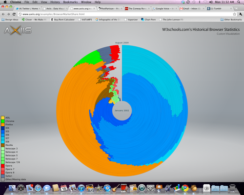
Here’s a very cool interactive chart showing the evolution of browser marketshare from January 2002 – August 2009. It dovetails nicely with recent benchmarking data, which indicates that you should probably at least give Chrome a try. I’ve been using it on my main Mac for a while now and am quite pleased.